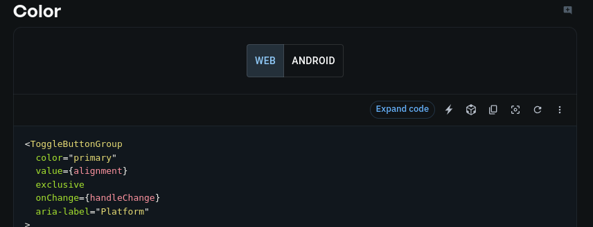
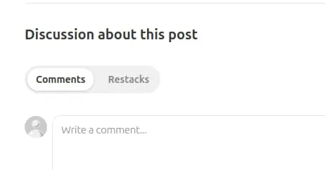
Had to push back on a poorly thought out design around two state toggle button set again. I have been doing this since the days of jQuery UI, then Bootstrap, now MUI. I feel tired.
In short toggle button sets like the one in MUI are not good enough when used basically as a radio option set.
Example: Without thinking too much about it which is the active button here?

To be fair, the situation in MUI is slightly better than it was in old examples with jqueryUI and Bootstrap, but not significantly so, in my opinion.
Here is a post that claims the color sceme alone is sufficient, but I just don’t agree. Maybe when there are more than 2 options, maybe, but even being generous, thinking you can fix this issue purely with color is not giving enough weight to accesibility.
Smashing Magazine has a very length entry in this - ultimately I felt they relied to much on data from some flawed user reseach, and not enough on solid design theory, and their recommendation was far too squishy.
In the past my proposed fix was to use icons, but another quick fix I think works pretty well is adding some margin around the set. It gives a quick visual cue that connects the background state as the ‘off’ state.
Here is a gist for that component, coupled with a nanostore for persistence. Works pretty well from a UX perspective in my mind.
https://gist.github.com/aeischeid/91eba0be747aedcbc63fb85f43c086e3
I see this solution popping up more, so there is hope out next generation of UI libraries won’t have this same mistake, but I am not one to hold my breath these days.

Update
Well color me wrong, I don’t love it’s reliance on Tailwind, but plenty else about Skeleton is appealing, including its radio-groups component